SBO.net - Senior Product Designer
My time on this product at BLEXR was definitely the shortest of the three. Mainly, it was improving the site’s experience through various CRO audits on areas, asset curation for CRM and also introducing a handful of new properties to the site.
Key Responsibilities as a Senior Product Designer
Revisit the main user’s journey and suggest key areas of improvements
Lead research, prototyping and designs on the new world cup promotional calendar for partner offers
Curate a new Design System for the online presence on Figma, as well as introduce a new CRM asset library template for promotional and consistent communications
Carry out numerous CRO audits on the key pages across the site with the aim to improve conversion and experience
Key Considerations
Must learn and understand the product’s branding due to the established digital profile it already has
Consistent communication across the various teams (CRM, Commercial, Product and Engineering) to ensure projects and goals are met to the best of their ability
Due to resource limitations, ensure that suggested improvements are in scope for the allocated timelines, as well as ensuring that the improvements are possible with the platform the site is hosted on
World Cup Calendar
The main project I worked on was introducing a new World Cup fixtures calendar to our sports betting site. The goal for this project was to ensure that with the new tournament coming into play this year, we wanted to ensure that the user’s experience around placing bets for the numerous games was simple, streamlined and effective across the site. Another focus of this project was to introduce selling positions for partners to promote themselves. This was to showcase them to the user as the prominent choice of the options available for a static source of revenue.
Through various kick-off meetings & stakeholder engagement sessions, we decided that the new feature would be added to the navigation to ensure that no matter what page the user lands on, they can access it with ease.
I then started creating a mood board showcasing similar calendar ideas across the industry with our competitors, as well as hospitality websites for calendar designs and e-commerce for product/event releases to get ideas for how it should function. I strongly believe that when looking for inspiration for a project, you should expand your searches across to other industries, as staying in your own may stump creativity and ultimately just result in creating a recycled experience with no personality.
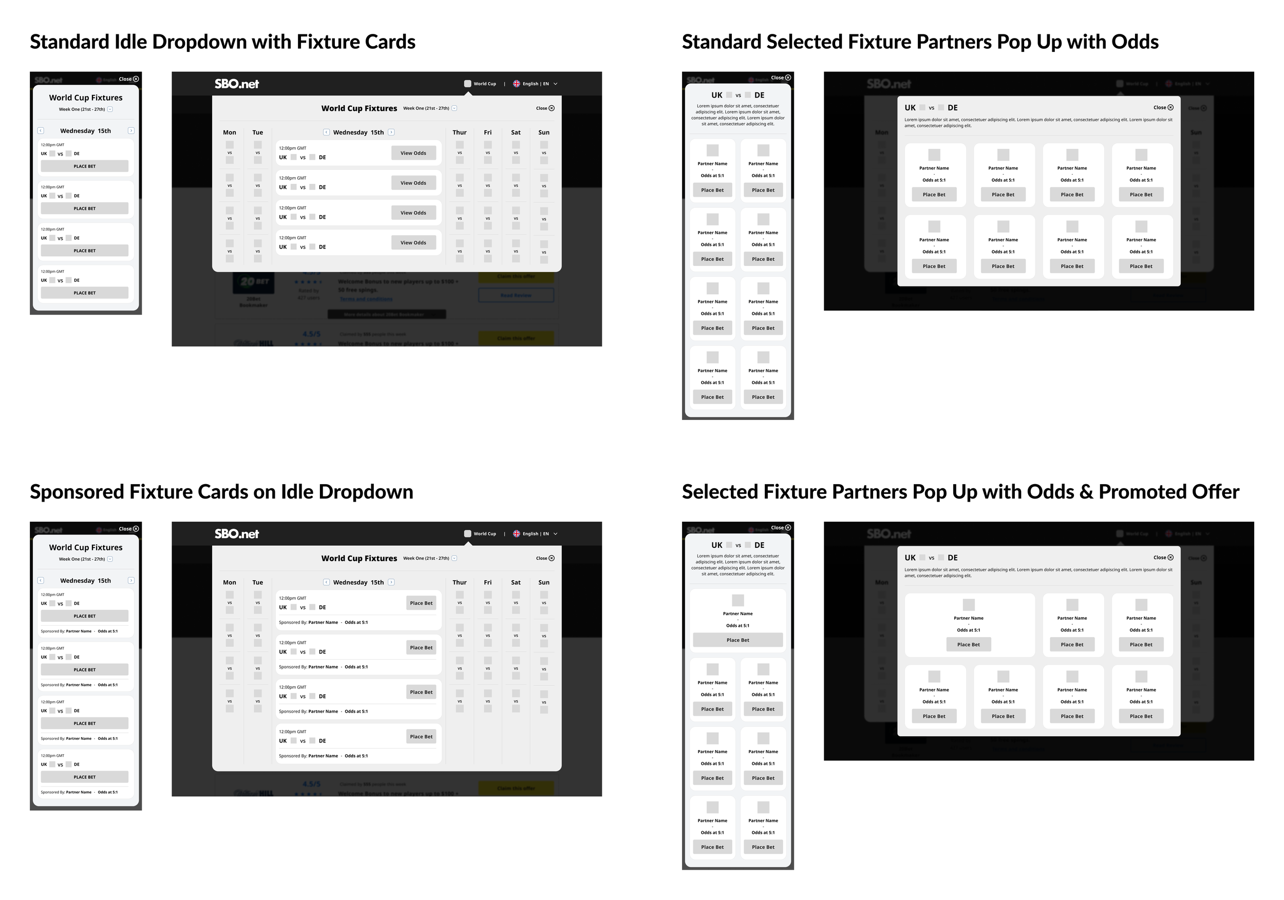
Low-Fidelity Wireframes
After showcasing the findings I found across various industries and products, I then created some sketches to present to the team, engineering for scope purposes, and our stakeholders. Following this, I then created some low-fidelity wireframes, as well as a clickable prototype on Figma, to bring the ideas to life.
The designs shown display the fixture calendar dropdown once clicked, as well as various card styles and instances. It was a priority of mine in this stage to showcase all potential styles of the cards, whether they are promoted by a partner or not, so that we have the full product in view.
Cards showcase the abbreviations of the countries playing in said match with accompanying flags, as well as the countries’ flags, also in view for the unselected dates. The decision for this was so that the user can easily locate the countries/matches that they are seeking without needing text to support the search.
The CTA on the promoted games will lead straight to the partner’s site, whereas with the non-promoted games, the CTA will show a clear pop-up with available partners and their odds, so that the user can clearly select an option to convert.
There is also a second version shown where I introduced the idea of potentially selling a space in said pop-up to a partner across the tournament to be the key option of choice. This was included so that, without a fixture promotion, we can still meet the goals of having a static revenue stream by allowing a partner to be the top pick across all non-promoted games via the pop-up.
High-Fidelity Wireframes
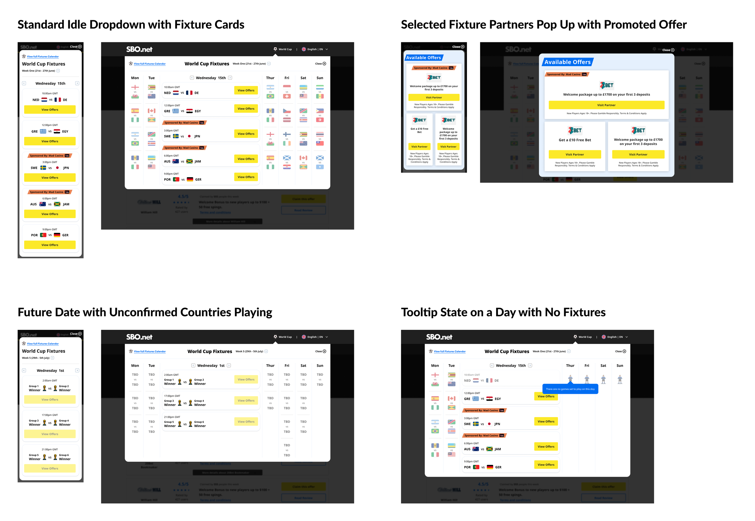
Following the Low-Fidelity wireframes sign-off, we carried out some user & gorilla testing to ensure that the designs were easy to use and effective towards the goals of the project.
The High-Fidelity designs were then curated following the success of the testing, allowing the brand’s personality to be shown on the new feature. An animated football was introduced to the navigation to draw the user towards the dropdown button, which proved effective upon testing again.
The combination of the country flags, brand colouring from blues and yellows selected, and finally the promotional elements of the badge on the top of the fixtures portrayed the personality we were looking for on the calendar.
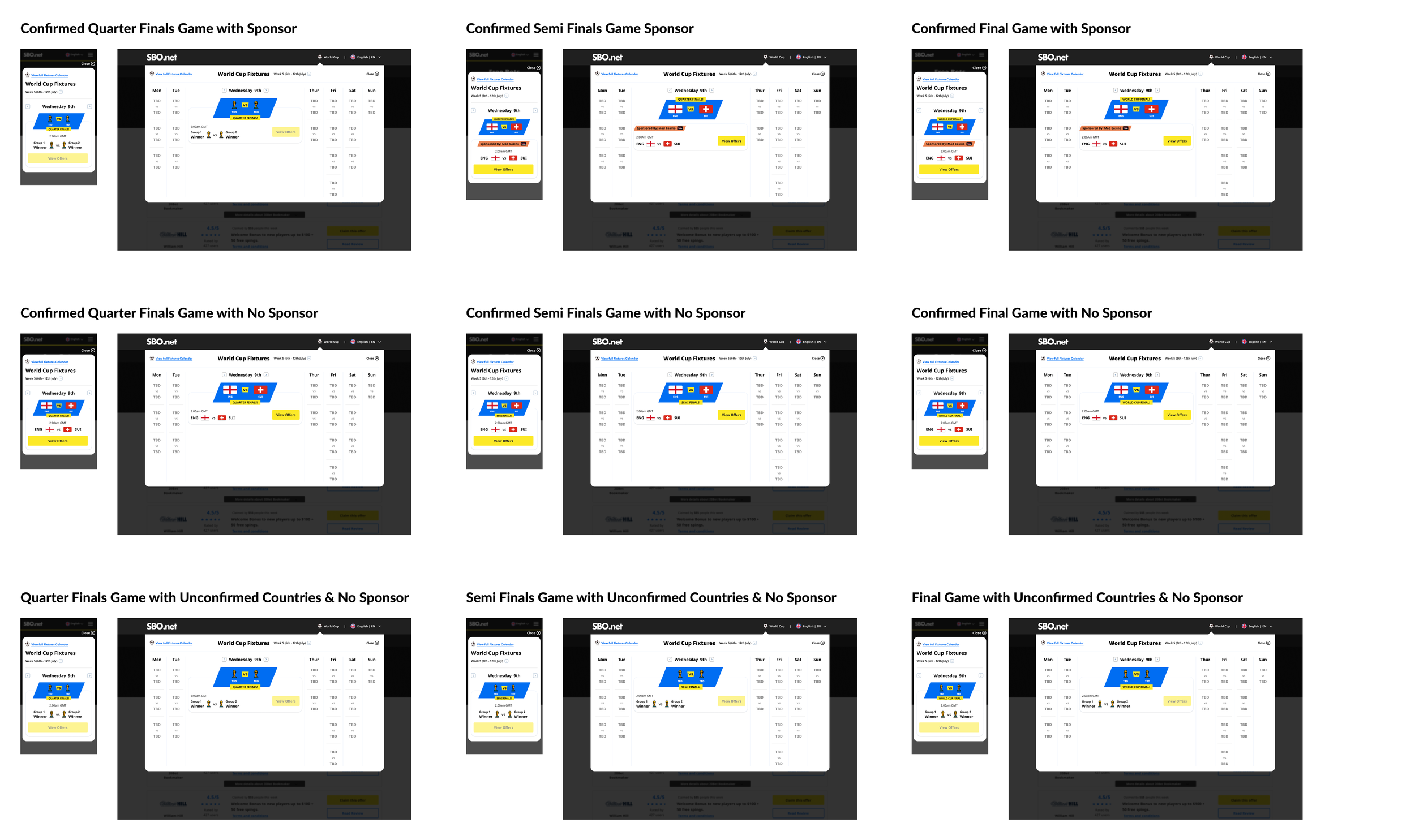
As you can see below, I created all instances for the fixture calendar to ensure that, whatever the situation with the matches, they were covered. This included if a game’s countries were not selected yet, if there were days in the future where there were no matches, a tooltip would appear. I also suggested including special UI treatment for the Quarter, Semi and Final games in the tournament to add to the special nature of the event.
Unfortunately, the API to introduce the partner odds was something which would delay the project’s timelines quite significantly, so this feature was removed, but ultimately the team decided to go forward with selling the position on the general CTA to gain some extra revenue from the product’s introduction to the site.
Engineering Handover
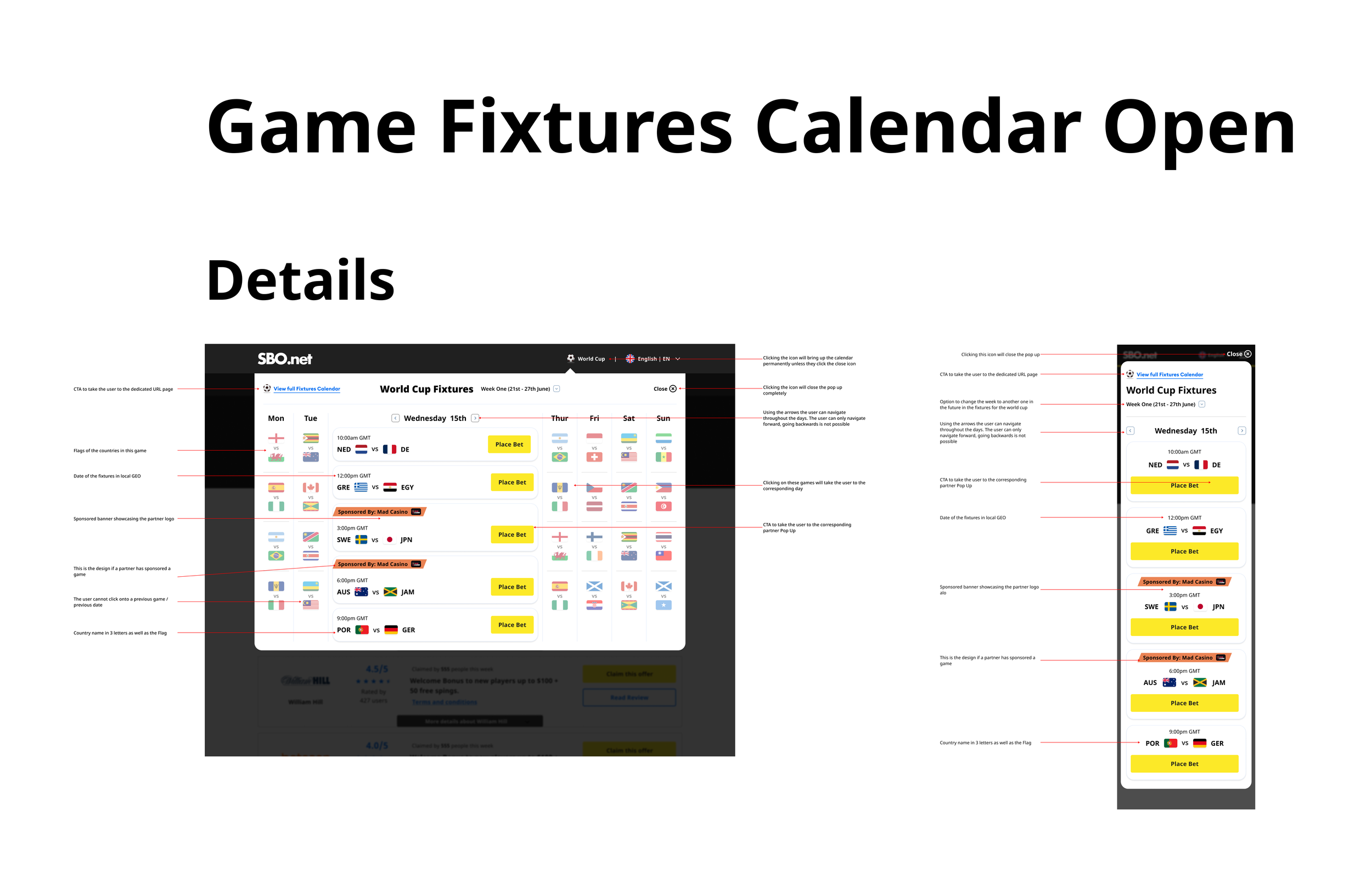
Following the success of the designs, as well as cross-team sign-off on their goals being met, I then curated a detailed handover document for the engineers to start carrying out the next stage of the project.
Once the handover was completed and checked by product & stakeholders, I organised a meeting with the engineering team to go over first looks in the handover, as well as providing them the link 48 hours before to ensure that if they had any concerns, we can discuss in the meeting together. A snapshot of one of the numerous pages in the handover is shown here.
During the engineering process, I organised 2x a week catch-ups with Product Owners, Managers and Stakeholders to go over anything that was causing problems to ensure that we were all on the same page with the production.
Upon completion, we carried out numerous design QA’s to ensure the quality was up to the standard required, as well as extensive feature testing to iron out any bugs & errors.
The Conclusion
The project was a success and ultimately resulted in a new experience for our users to enjoy. As well as this, the commercial and product teams were happy that we had multiple new sources of revenue through the various options on the calendar. The new feature is live and has gained attraction with our users, which is great news, of course. Thoroughly enjoyed this project and the team I worked with!