Hero Health - Figma Design System Optimisation & UI Design
During my short term as a contractor at Hero Health, I was tasked with optimising their existing design system in Figma with a focus on their new elements as well as covering all instances using Auto-Layout. Additionally, I also was required to create responsive UI designs for their product and website.
Link to the Figma project file - Open
Key Responsibilities as UI Designer
Ensure that all instances of the elements created have been explored and completed.
Create braking points for the components so that they are accessible across all screens.
Create consistency across all designs so that there is no possibility for errors.
Design dashboards and user logins to harbour information for our local practice doctors to view and use to contact the user.
Understand and Use Government Design Systems (Specifically NHS Design System) for key projects focusing on optimising the booking system.
Build designs which are used across the product’s app and responsive website (Desktop, Tablet and Mobile).
Key Considerations
Ensure that designs comply with the Government Design Systems when required.
Focus on the existing brand guidelines when re-designing outdated elements.
Providing designs that can be viewed easily by all ages/audiences due to the nature of the product.
Making sure that all elements are using the correct Auto-Layout setting to ensure responsive and functional use
Design System Element Optimisation - Hero Health Focused (Auto Layout)
The following elements are some examples of the work I assisted/created on the Hero Health platform (See link above to view all). The contents consist of different instance states for their Primary, Secondary and Text Link CTA’s, Dropdown used across various pieces of content and Badges for content being categorically tagged.
For each of the CTA styles, we have 3 different instances shown across 6 different sizes. The sizes shown would vary between Mobile, Tablet and Desktop resolutions. The button instances showcase the three different hierarchies (Primary, Secondary & Text Link), with both sets multiplied for options with Icon left or dropdown.
The badge instances are also very similar in layout to the CTA’s, showcasing the Small or Large option, with choices to include a Dot or Remove icon to combat all functionality when in use. There of course is also the different varying colour options for different categories.
Finally, displayed centre of the group, is the dropdown instances. These options consist of the Idle or Active state of the dropdown, with the active states displaying the different types of dropdown items. We have the option for Idle or Hover dropdown items, as well as the option to add a dividing stroke or an Icon to the left. Covered here also are the 3 dotted menu items which are used on some setting areas, as well as filters.
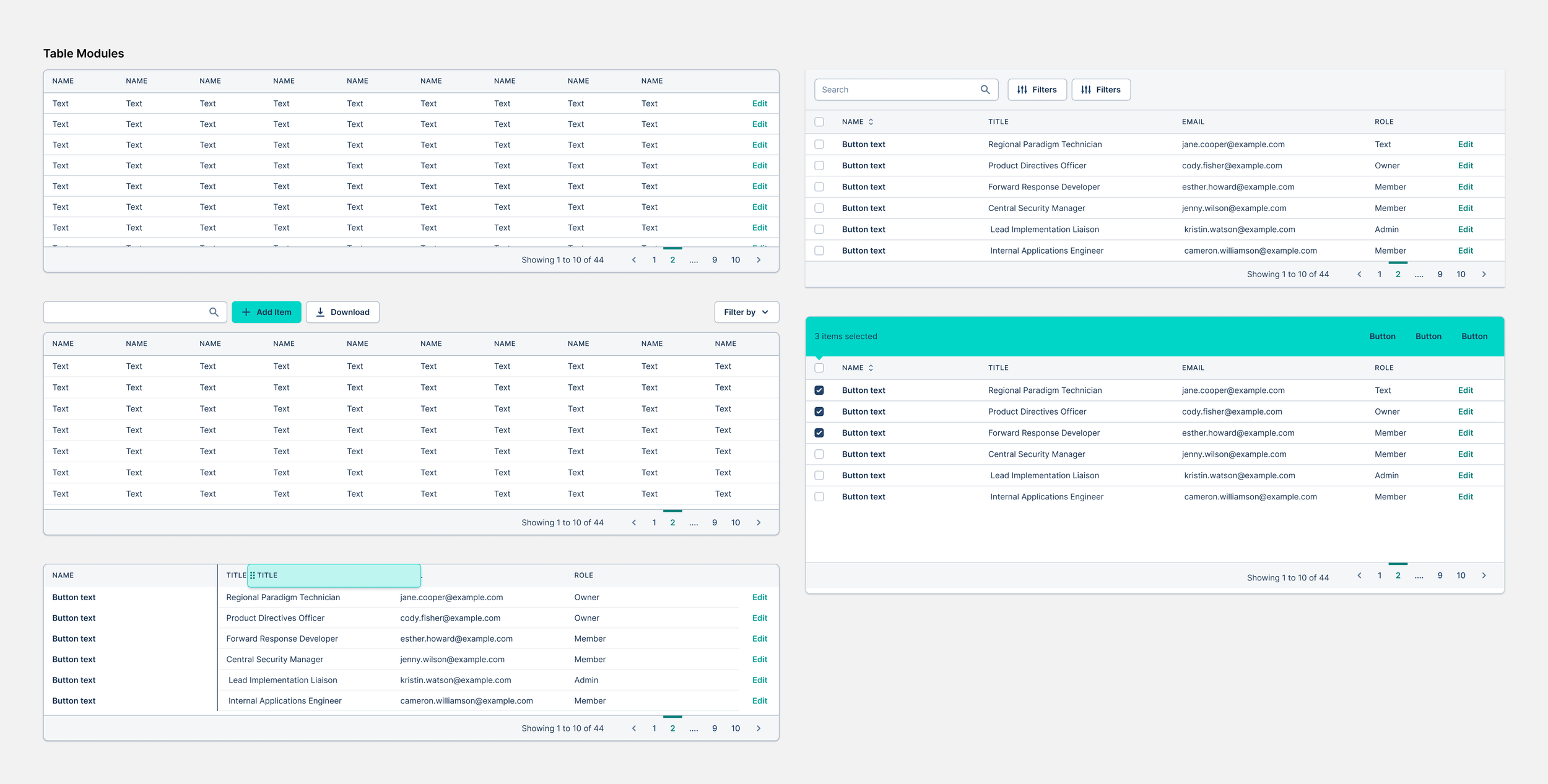
As well as these, we also have the second set of elements which are individual elements for different components such as tables and cards. These single elements are very important throughout a design system as it allows consistency between all componenets when singular elements are amended.

EMISS & NHS Portal Components
Alongside the elements above, during my work optimising the NHS journey in the Hero Health product, I was tasked with creating similar components but in branding applicable to the portal.
This journey was on EMISS and I believe it was a collaborative effect between the NHS team and the EMIS accepting different shades of blue specifically for this portal.
As you can see, we have all of the states for the buttons (Idle, Hover and Active) in the 6 different sizes possible. Again, the different button styles are Primary and Secondary, with both sets duplicated for options with Icon left or dropdown.
The NHS button instances on the right were used to take you to the NHS login portal, these were strictly following the NHS guidelines, but I was tasked to recreate them for our library.
Design System Component Optimisation - Hero Health Focused (Auto Layout)
Following the work on the elements above, using those once signed off to create components across the site was important as when editing the original element, it would amend all components connected to that element. This is a great feature as it allows amends site-wide with minimal effort
Below is a slide show of multiple different sets of components that I created/amended/used throughout my time at Hero Health. All components have each instance and state covered for use, as well as responsive designs which are viewable in the Figma file.
To view all of the components in this project, please click here


