Roja Parfums - Apex Product Landing Page
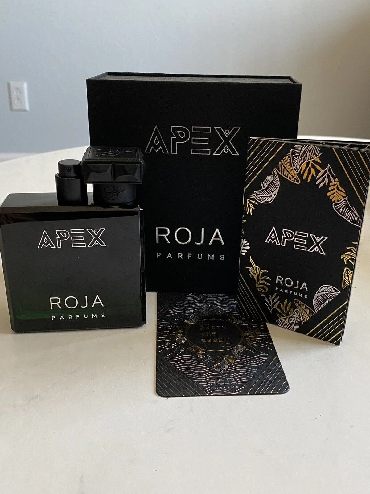
Roja Parfums came to us for a responsive landing page design that would convey the story of the product’s background, ingredients and personality. The purpose of this design was to be sent to different department stores across the world to gain their interest in the product, to then enquire about stocking.
A unique module was also to be added to the design, displaying the customer’s individual “Apex Animal” card which was randomly supplied upon opening the packaging. My goal was to make an eye-catching but fun module which would entice the user to interact, as the card game was one of the product’s key stand-out features, due to the sense of individuality from each purchase.
Key Responsibilities as a UI Designer
Create a Landing page that ties together the physical and digital products together.
Give a clear understanding of the Product’s look and feel through the design.
Include a standout module which allows the user to interact with the page and find their “Apex Animal”.
Create a responsive design so that users on all screens can view and enjoy.
Key Considerations
To keep the user engaged with the content.
Image-to-content ratio for smaller screens.
Easily accessible CTA’s to allow the user the user the option to download extra media.

Stage 1 - Researching into the Product
The client was kind enough to supply me with a product so that I could research further into its packaging and story. This allowed me to brainstorm different ideas and textures to use in the digital product so that I can assure the client that both the Physical and Digital products would be aligned in conveying it’s story.
After scanning in different textures and patterns that was used on the packaging, I started to create different art-boards to display the creative methods of backgrounds and layers we could use as a starting point. Following this, I wanted to keep the product’s logo and the client’s logo in the same aspect ratio as the packaging to keep consistency so this was also noted down.
After a brainstorming session, I decided that I wanted to use the card’s waved texture, enlarged as the background throughout the page’s design due to the nature of it being used on front of each unique card, so this would tie the page and the product’s features all together.
Stage 2 - The Design
Due to the product’s animalistic nature, I wanted to have a dark setting on the page to allow the colours of the photography and the product itself, to stand out and catch the user. Upon landing, we have two clear CTA’s accompanied by the product and client’s branding. I wanted to make sure that the user has a clear starting point to download more media of the product as soon as they land on the page.
The hero area I feel grabs the user with the strong photography accompanied by the background textures and product messaging which was also scanned in from the physical. Following this with some smooth animation and parallax scrolls (Which are displayed in the video below), we are met with a strong full-width image to show the two variations of the product.
The ingredients area was another feature that I wanted to make sure the user could interact with, as listing the ingredients in bullet points simply would not fit the flowing dark nature of the page. The 5 key ingredients are showcased around the product, in the shape of the bottle’s lid, allowing the user to hover over them to find out more about how it is used (Showcased in the video below).
Finally, we are met with the card game at the bottom of the page, with some of the cards displayed with the client’s supporting copy. I introduced the hover animation to the cards, as I felt it would allow the user to view a small amount of the product’s unique options, thus sparking their interest in the “Play Now” button. Clicking the play button would display a simple flickering animation, showcasing the multiple options, which is then met with the user’s “Apex Animal”. Supporting this, we have text describing the characteristics of this animal, for the user to enjoy with also the option to be taken back to the top of the page.
