RioBabe Site UX / CRO Audit
RioBabe came to us for a complete redesign of their Homepage and Product page on their site. The aim for this was to Optimise their Conversion Rates by researching competitors in the market and reporting my findings.
As well as this, the client felt that their design at the time did not represent them as a brand as much as they would like. So my goal was to tie in the look and feel of the physical product and their digital product whilst focusing on the site’s functionality.
Key Responsibilities as UX/UI Designer
Optimise the site’s Conversion Rates.
Completely redesign the site to tie in with the physical product’s branding.
Use the client’s brand guidelines to ensure that the branding is consistent.
Create a responsive design to be viewed across all screens.
Allow the user the option to purchase a product at all times using eye-grabbing CTA’s.
Link into the client’s social media to allow further engagement.
Key Considerations
Accessibility for all audiences due to the bright nature of the client’s branding.
Making sure that the product’s standout features are visible using a featured module to grab the user’s attention.

Stage 1 - Researching into the Product and Competitors
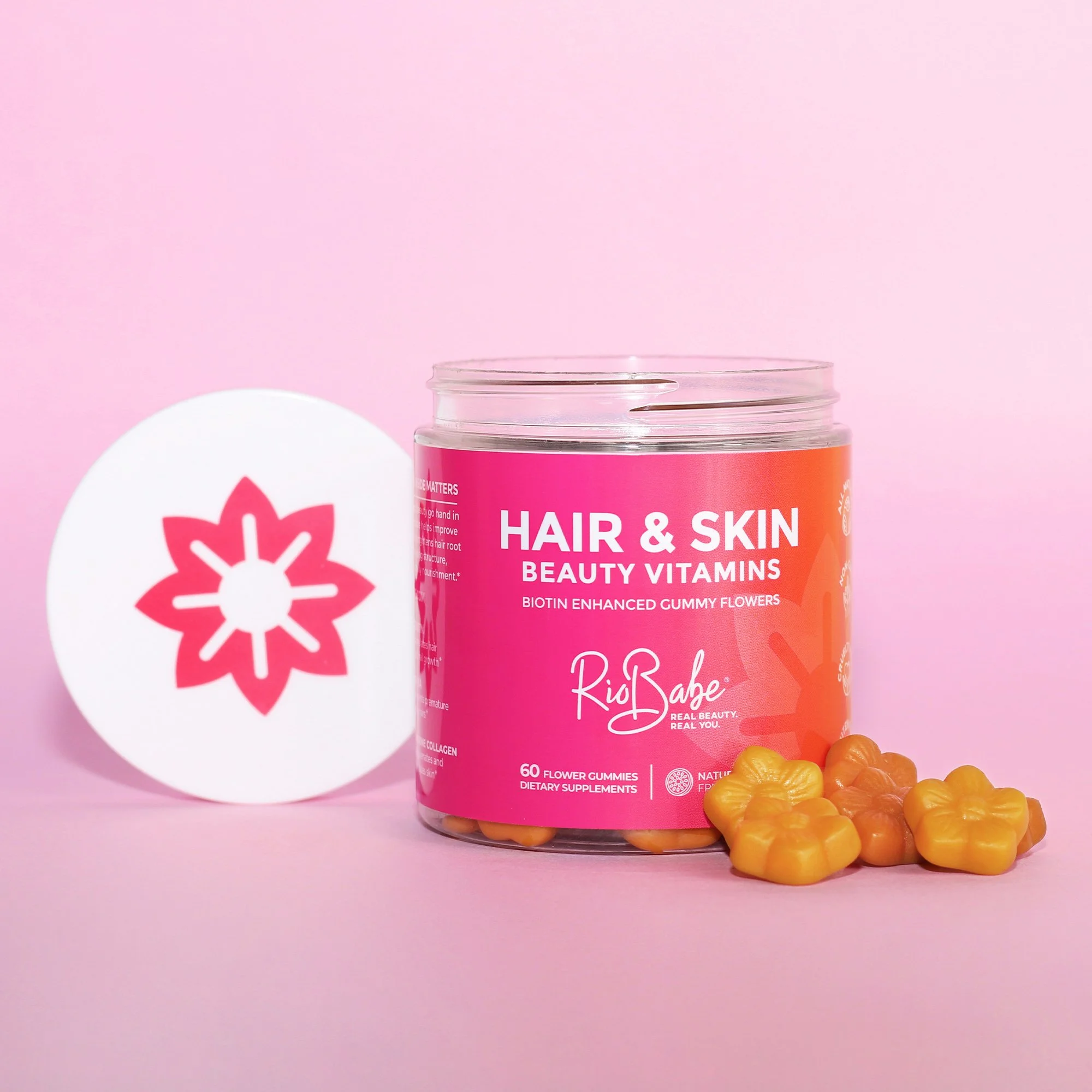
The client was kind enough to supply me with one of their products so that I could look into the branding to find features to tie into the digital site. A standout characteristic that caught my eye instantly was the shape of the lid which is also the shape of the product. I knew using this as an accent feature on the site would tie the two nicely together.
As well as this, the colour of the lid’s shape combined with the white grabbed my attention instantly, so I knew that this could be a strong option for the site’s CTA’s and important information.
Following this, I researched some of their competitor sites and compiled a document for the client to view. This was filled with numerous features and methods of displaying content which I thought could tie in nicely, with the message they are looking to convey to their audience.
I then presented my ideas and findings to the client, which allowed us both to manage expectations and ideas for the site’s designs. As well as this, we further collaborated on discussions around assets and imagery to showcase the brand.
Stage 2 - Homepage Design
After discussions with the client, it was clear to me that they would like a large image with their strapline to be the focus on the hero area, accompanied by a CTA for the products. As well as this, we can see that the Pink colour from the physical product has been used as the accent for the site, allowing the two products to tie in nicely with one another. Following this, we have a gradient displayed at the bottom of the image, to entice the user to scroll down and be met with a carousel displaying their two products as well as bundles.
I chose to use large imagery supplied from their asset library alongside their product imagery throughout the design, to give the user a sense of confidence in the product. As well as this, the client’s strong imagery of the models and ingredients, really ties in with the look and feel of the product’s beach/summer aura to create a positive output.
Using iconography to display the features of the product matched the product’s branding so it was important to convey the messaging similarly. Additionally, the collage look and feel accompanied by the iconography, gave the page a refreshingly modern feel, especially when incorporated with the Pink elements.
As well as the method of using both model and product photography together to gain the user’s confidence, I also created a standout module to allow the reviews from their customers to draw in the customer’s with their honest opinions. We found that this module was strongly interacted with upon publication of the design.
Homepage Animation
Stage 3 - Product Page Design
Following the Client’s positive sign off of the homepage, I moved on to the product page where I could focus on conveying the story of the product rather than the brand specifically.
The eye-catching modules below the hero, accompanied by the background accent shapes, grabs the user’s attention to pull them into the content. Showcasing the key characteristics of the vitamins using iconography, imagery and distinct text proved to be a great choice after publication as we noticed that users stopped to read this content often before conversion.
I also wanted to make sure that we both show the packaging and the vitamins themselves on this design to ensure that the customers is familiar with what they are purchasing inside, and out.
Including the Reviews area on this page again gave the user that extra push towards conversion due to the positive feedback from the client’s already existing customers. Additionally, if the user decides that this product is not meant for them after reading the reviews, I accompanied the module with further suggested products to ensure we are giving one last push towards conversion.
The Results
Following the publication of the rebranded Homepage and Product page, the client was very happy to report that the number of Visitors and Sessions had increased, with Conversion rates drastically improving due to the increased add-to-carts results.
+615%
Increase in conversion rates
-175%
Reduced bounce rate across product pages
+173%
Increase in Add to Carts

