Three Mobile Uk - Customer Comms
My main role at Three was to work on optimising their main user journeys, as well as improving the UI to better match the brand and modern styles. Additionally, I was tasked with many projects in the Customer Comms departments to take the lead on designs if the resources were required as well as managing stakeholder expectations.
Key Responsibilities as a UI Designer
Lead major product launches to ensure the creation of communication assets are delivered on time.
Follow existing design systems and guidelines, whilst also pitching creative additions to stakeholders when required.
Hosting brainstorming sessions with team as well as clients to allow everyone to have a clear understanding on requirements and expectations.
Pitching my designs to stakeholders during multiple feedback sessions before development handovers.
Accessibility and responsiveness testing to ensure sign-off before being sent out.
Curate detailed handover documents and asset management systems for the development team to use throughout production.
Key Considerations
Content to be both internally (and externally when applicable) signed off before launch to ensure the legality side of production.
Focus on creating designs that present the brand’s image in a familiar but effective manner.
Ensuring that the design’s pass accessibility checks, whilst also being responsive, to allow users on all devices a smooth experience.
When applicable, having to not only just focus on Three’s design systems and guidelines, but also on the client’s (Apple + Samsung).
Project - iPhone 15 Release and Generic iPhone Upgrade
One of the more exciting projects in the Customer Communications team was to lead the designs which were sent to customers announcing the launch of one of the most anticipated products last year. Working on this project allowed me to experience working closely with Apple’s design team, as well as their design systems & guidelines.
The first set of designs that you can see are two variants that were sent out to the Three Business market. The first design was sent to new customers who had signed up for the email newsletter, and the second being sent to existing customers asking to upgrade. It was important to create two separate designs, to make sure that we were reaching all of our market’s capacity and then ensuring optimum reach. Focusing on showcasing the new features of the product, as well as promoting Three’s trade-in offer, were the two key requirements of this project. These two areas are the standout elements throughout the design to ensure the user’s attention.
The second set of designs that are displayed were created to be sent out throughout the year, to persuade their customers into upgrading their device to a newer model. The left set was sent to customers after the iPhone 15’s launch, showcasing to their market that their older models are still available for upgrade. The right set, which was sent to users who met the requirements, is a personalised set of content informing them of the business’ decision to remove 3G networks from their services. Giving the user a clear indication of how they can get in touch to upgrade was the main focus of this set of designs as it not only keeps the trust between the two parties, but also gives an option to add another stage of repeat business.
Project - Galaxy Z Fold5 + Z Flip5 + Tab S9 Series Release
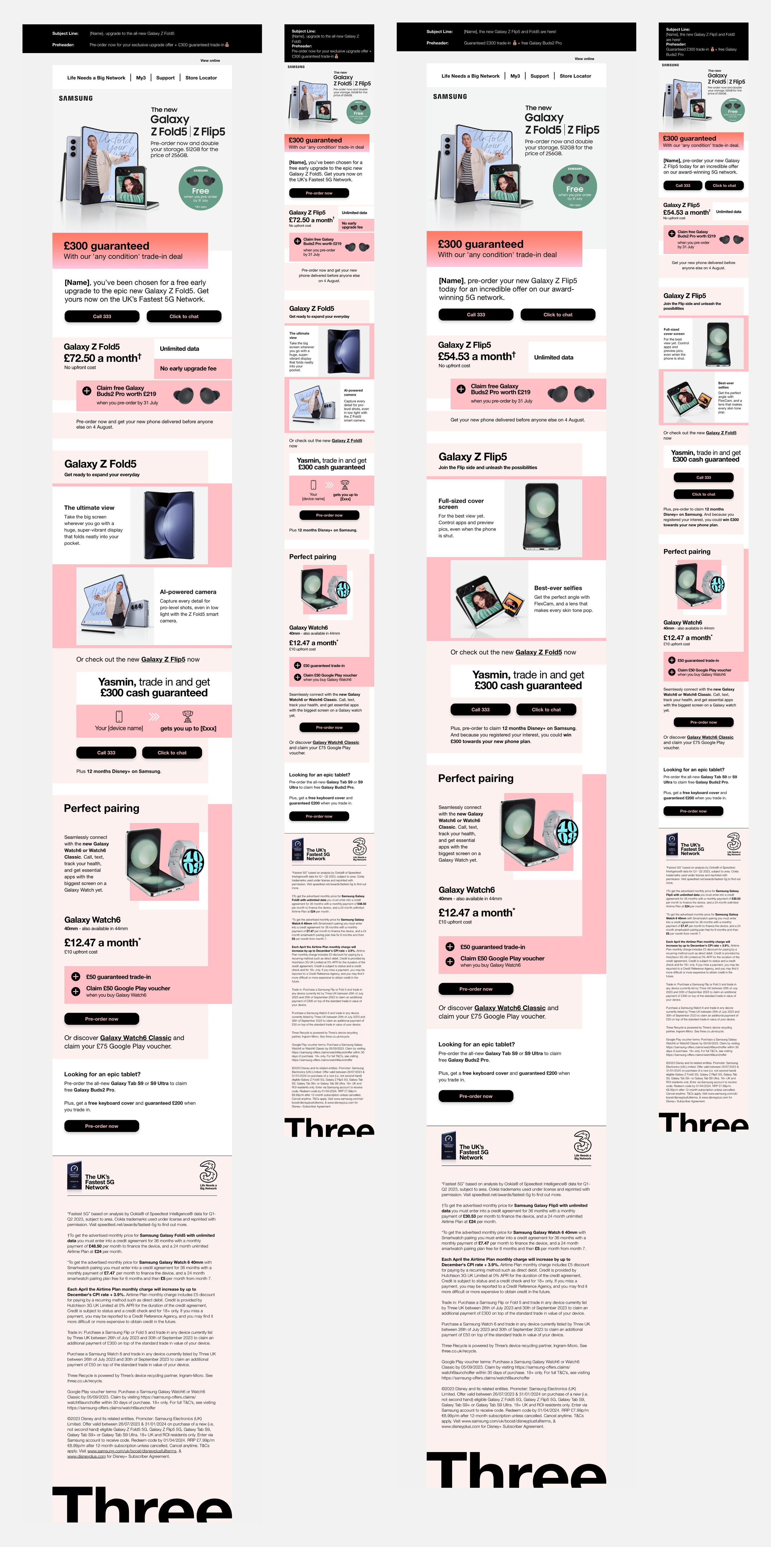
Similar to the iPhone 15 designs above, this module was focusing on Galaxy’s Z Fold5, Z Flip5 and Tan S9 Series release. In this project I was heavily involved with Samsung’s legal team, submitting and pitching designs through numerous rounds of amends to achieve sign-off and publication.
Showcasing the folding aspect of both products was a key feature in these designs, as it was not only a great aesthetic to the phones, but also functionally was a stand-out feature with the cameras and screens. Using strong assets provided by Samsung, allowed me to create modules and collages of the products to give the user a clear view of the product inside and out. Two other key features that needed to be promoted throughout were the trade-in option for existing customers, as well as the option to claim a free pair of Galaxy Bud Pros.
Informing the user of the Trade-In deal in the hero area enticed them to scroll down and find out more about the stand-out product as well as the information about the deal. In addition to the hero promotion, I included a stand-alone module halfway through the page to ensure that the user would not miss it as it is also accompanied by personalised text discussing their existing contract. The choice of incorporating the deal for claiming the Bud Pros near the pricing details reassured us that the offer would not be missed, as well as gave a clear indication of the terms around the date restrictions to complete.
We also came to a decision to include another stand-out module to display the other corresponding release to advertise the other product in the line. As you can see in the first email design focusing on the Z Fold 5, we have a module advertising the release of the Z Flip 5 which takes the user to the product’s page on the Three site. This is also repeated for the Z Fold 5 on the Z Flip 5 design.
Upon sign-off of the two mobile devices, we used the same styling and modules to advertise the Tab S9 Series to their market. This is so that the user can understand that the line is all related to each other, whilst also using a layout we know works and is on brand with both Samsung and Three.
Project - Three+ Christmas Newsletter
One of the more fun designs that I carried out during my term at Three, was the Christmas Three+ Newsletter which was sent out to their market advertising the benefits on offer throughout the app. Staying on brand whilst also including a fun and festive element throughout was fun to experiment with, especially when collaborating with our print and physical product team to include the snowflakes and star vectors throughout.
Some of our partners and special offers required their own personalised stand-alone module to grab the user’s attention. Working closely with the Asset management team, we allowed each area to feel individual but also stay on brand with Three’s branding
After numerous rounds of design pitches and amends, the final product is something that I am very proud of. The holidays are an important time of year for their market, so creating a fun but festive email focusing on all of the treats and gifts available for purchase, was my main focus and I feel this was achieved.
Project - Three+ App Rewards Email
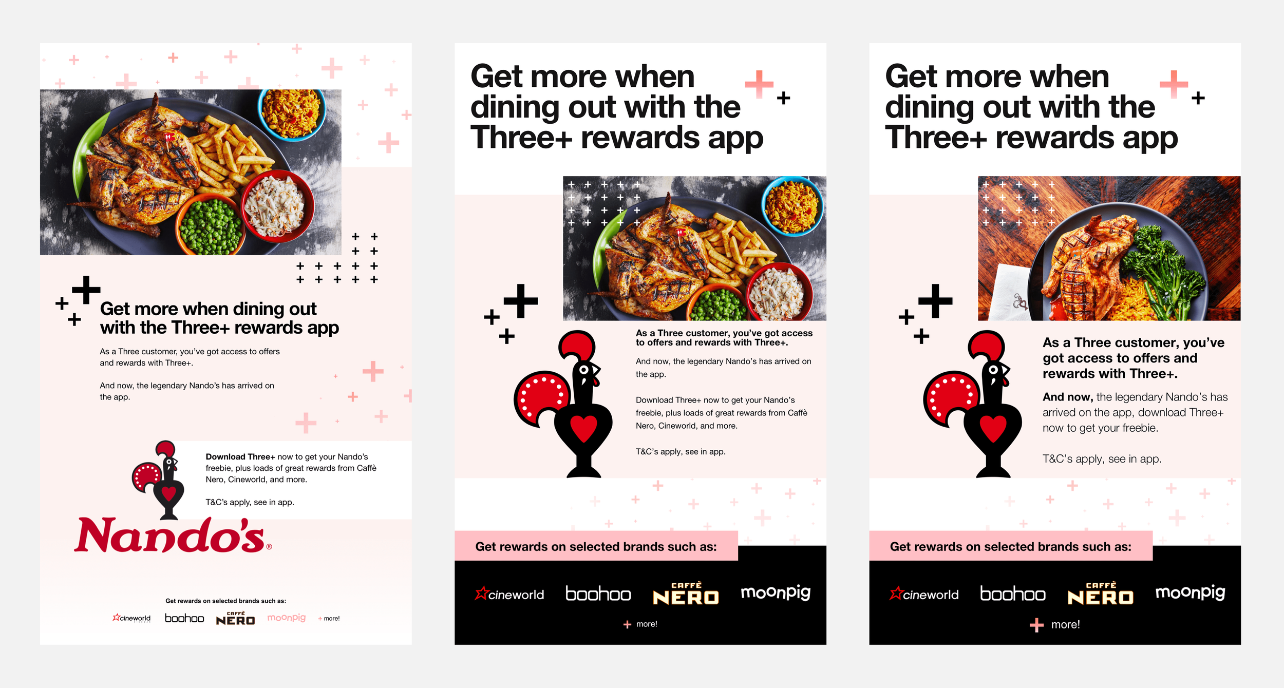
This task was both simple and fun as the focus was to work closely with Three+’s partner Nandos, to help advertise their promotional offers on the Rewards App. The main focus was to grab the user’s attention upon load by using both Nandos and Three+’s branding elements, to then entice the user to download and receive the offers.
I enjoyed testing new ways to display the Three+ branding patterns, alongside the Nandos assets which were provided to me. We finalised with a minimal hero area focusing on the introductory text which was accompanied by subtle Three+ Branding, an eye-grabbing image from Nandos accompanied by Three+ patterns, followed by persuasive body copy and logo to entice the user into downloading the app which was then met by a promotional banner showcasing the other partners available on the App.
If you are curious as to why there is no CTA to this design, it is because both internal and external stakeholders requested the whole design area to be clickable and upon build, the “See in app.” was then made a hyperlink to the app store
Project - General Newsletters
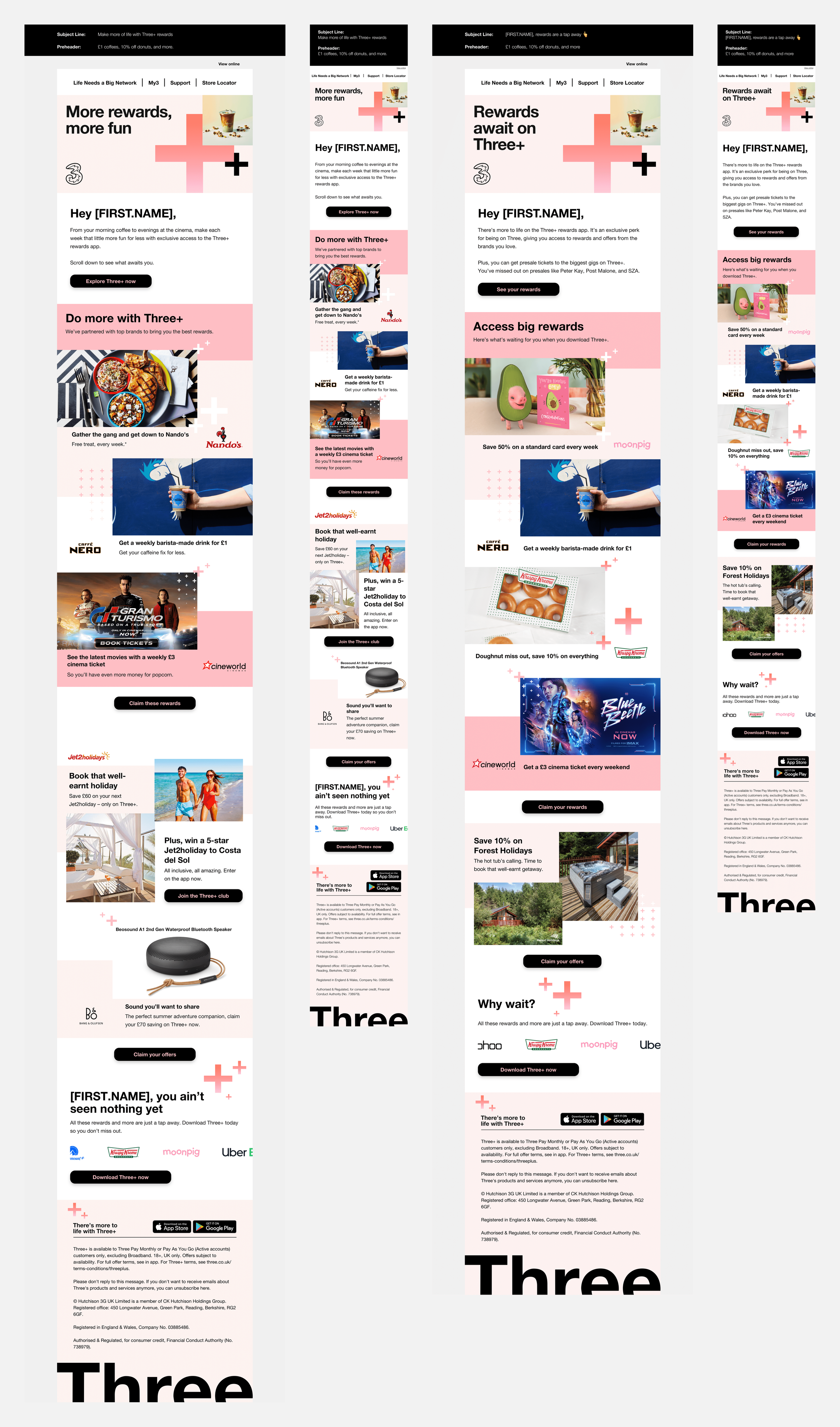
The following sets of designs are to display my use of Three’s design system and component library over the 10 months of my employment. These were curated mainly using styles existing from previous signed-off projects and systems, which in some instances were personalised to cater to the content after being signed off by the heads of the design team.


